Plot Ranges of Data
# sphinx_gallery_thumbnail_number = 3
import matplotlib.pyplot as plt
import pyam
Read in some example data
fname = 'data.csv'

df = pyam.IamDataFrame(fname, encoding='ISO-8859-1')

df = (df
      .filter({'variable': 'Emissions|CO2'})
      .filter({'region': 'World'}, keep=False)
      )

print(df.head())
Out:
model scenario  region       variable       unit  year      value
9   MESSAGE-GLOBIOM  SSP2-26  R5ASIA  Emissions|CO2  Mt CO2/yr  2005  10488.011
15  MESSAGE-GLOBIOM  SSP2-26   R5LAM  Emissions|CO2  Mt CO2/yr  2005   5086.483
12  MESSAGE-GLOBIOM  SSP2-26   R5MAF  Emissions|CO2  Mt CO2/yr  2005   4474.073
3   MESSAGE-GLOBIOM  SSP2-26  R5OECD  Emissions|CO2  Mt CO2/yr  2005  14486.522
6   MESSAGE-GLOBIOM  SSP2-26   R5REF  Emissions|CO2  Mt CO2/yr  2005   2742.073
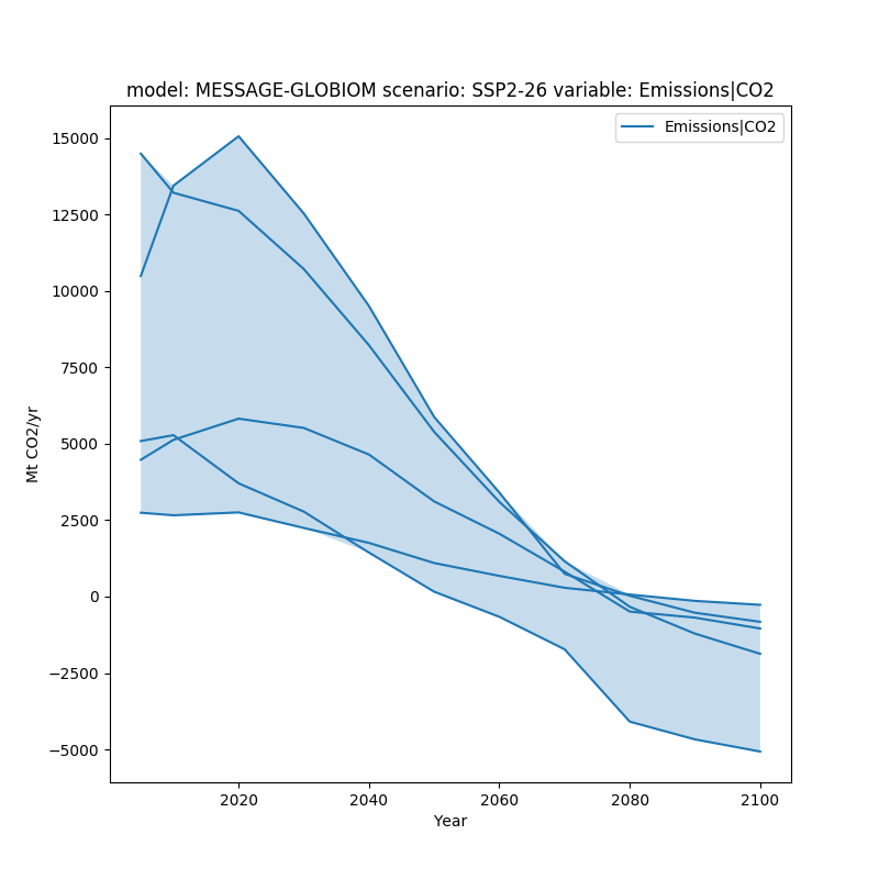
In this example, we want to show the range of a given dataset. We do this utilizing the fill_between argument.
fig, ax = plt.subplots(figsize=(8, 8))
df.line_plot(ax=ax, color='variable', fill_between=True)
plt.show()
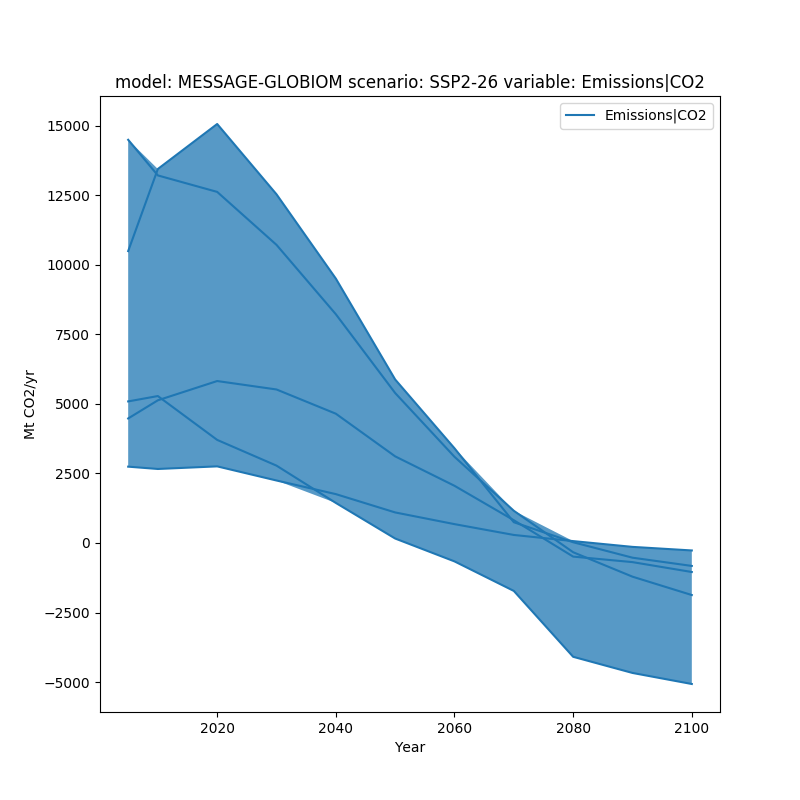
fill_between can simply be true, or it can be provided specific arguments as a dictionary.
fig, ax = plt.subplots(figsize=(8, 8))
df.line_plot(ax=ax, color='variable', fill_between=dict(alpha=0.75))
plt.show()
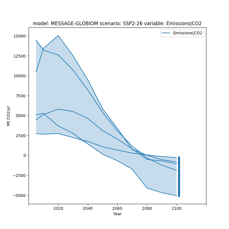
To further make the range of data visible, we can also add a bar showing the range of data in the final time period using final_ranges. Similar to fill_between it can either be true or have specific arguments.
fig, ax = plt.subplots(figsize=(8, 8))
df.line_plot(ax=ax, color='variable', fill_between=True,
             final_ranges=dict(linewidth=5))
plt.show()
Total running time of the script: ( 0 minutes 0.470 seconds)