Plot Data as a Pie Chart
# sphinx_gallery_thumbnail_number = 3
import matplotlib.pyplot as plt
import pyam
Read in some example data
fname = 'data.csv'
df = pyam.IamDataFrame(fname, encoding='ISO-8859-1')
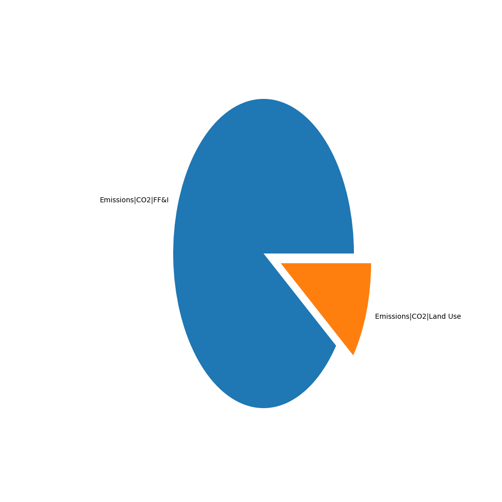
We generated a simple stacked bar chart as below
data = df.filter({'variable': 'Emissions|CO2|*',
                  'level': 0,
                  'year': 2050,
                  'region': 'World'})

fig, ax = plt.subplots(figsize=(10, 10))
data.pie_plot(ax=ax)
fig.subplots_adjust(right=0.75, left=0.3)
plt.show()
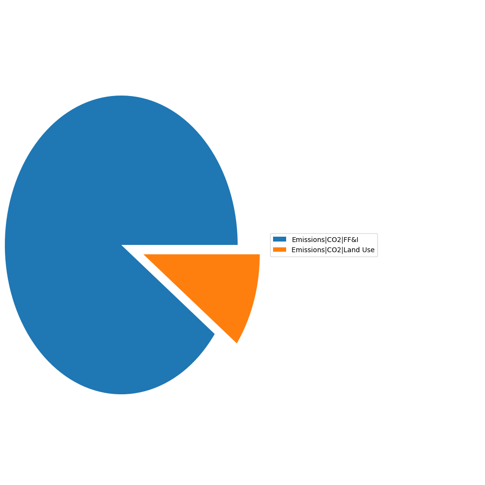
Sometimes a legend is preferable to labels, we can use those instead.
fig, ax = plt.subplots(figsize=(10, 10))
data.pie_plot(ax=ax, labels=None, legend=True)
fig.subplots_adjust(right=0.55, left=-0.05)
plt.show()
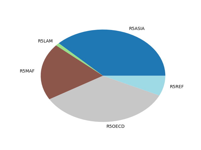
We don’t just have to plot variables, any data or metadata associated with the IamDataFrame can be used.
data = (df
        .filter({'variable': 'Emissions|CO2', 'year': 2050})
        .filter({'region': 'World'}, keep=False)
        )
data.pie_plot(category='region', cmap='tab20')
plt.show()
Total running time of the script: ( 0 minutes 0.115 seconds)