Plot Data as a Bar Plot
# sphinx_gallery_thumbnail_number = 3
import matplotlib.pyplot as plt
import pyam
Read in some example data
fname = 'data.csv'
df = pyam.IamDataFrame(fname, encoding='ISO-8859-1')
print(df.head())
Out:
model scenario  region       variable       unit  year      value
9   MESSAGE-GLOBIOM  SSP2-26  R5ASIA  Emissions|CO2  Mt CO2/yr  2005  10488.011
15  MESSAGE-GLOBIOM  SSP2-26   R5LAM  Emissions|CO2  Mt CO2/yr  2005   5086.483
12  MESSAGE-GLOBIOM  SSP2-26   R5MAF  Emissions|CO2  Mt CO2/yr  2005   4474.073
3   MESSAGE-GLOBIOM  SSP2-26  R5OECD  Emissions|CO2  Mt CO2/yr  2005  14486.522
6   MESSAGE-GLOBIOM  SSP2-26   R5REF  Emissions|CO2  Mt CO2/yr  2005   2742.073
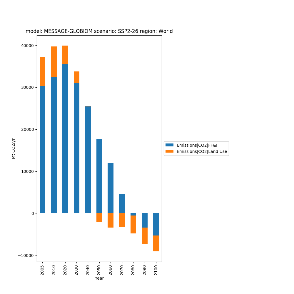
We generated a simple stacked bar chart as below
data = df.filter({'variable': 'Emissions|CO2|*',
                  'level': 0,
                  'region': 'World'})

fig, ax = plt.subplots(figsize=(10, 10))
data.bar_plot(ax=ax, stacked=True)
fig.subplots_adjust(right=0.55)
plt.show()
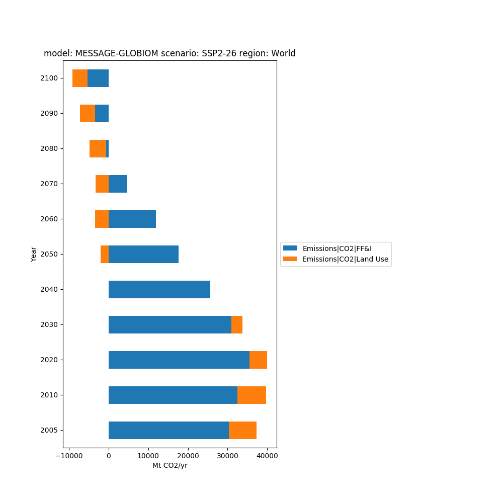
We can flip that round for a horizontal chart
fig, ax = plt.subplots(figsize=(10, 10))
data.bar_plot(ax=ax, stacked=True, orient='h')
fig.subplots_adjust(right=0.55)
plt.show()
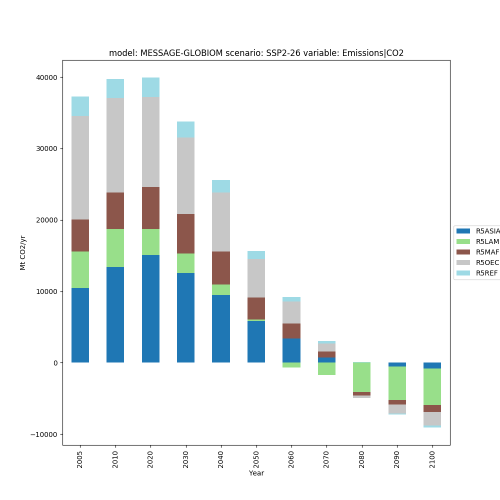
We don’t just have to plot variables, any data or metadata associated with the IamDataFrame can be used.
data = (df
        .filter({'variable': 'Emissions|CO2'})
        .filter({'region': 'World'}, keep=False)
        )
fig, ax = plt.subplots(figsize=(10, 10))
data.bar_plot(ax=ax, bars='region', stacked=True, cmap='tab20')
plt.show()
Total running time of the script: ( 0 minutes 0.360 seconds)