Plot Data as a Bar Plot with Net Value Lines
# sphinx_gallery_thumbnail_number = 2
import matplotlib.pyplot as plt
import pyam

from pyam.plotting import add_net_values_to_bar_plot
Read in some example data
fname = 'data.csv'
df = pyam.IamDataFrame(fname, encoding='ISO-8859-1')
print(df.head())
Out:
model scenario  region       variable       unit  year      value
9   MESSAGE-GLOBIOM  SSP2-26  R5ASIA  Emissions|CO2  Mt CO2/yr  2005  10488.011
15  MESSAGE-GLOBIOM  SSP2-26   R5LAM  Emissions|CO2  Mt CO2/yr  2005   5086.483
12  MESSAGE-GLOBIOM  SSP2-26   R5MAF  Emissions|CO2  Mt CO2/yr  2005   4474.073
3   MESSAGE-GLOBIOM  SSP2-26  R5OECD  Emissions|CO2  Mt CO2/yr  2005  14486.522
6   MESSAGE-GLOBIOM  SSP2-26   R5REF  Emissions|CO2  Mt CO2/yr  2005   2742.073
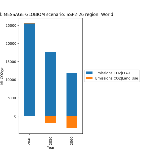
We generated a simple stacked bar chart as below
data = df.filter({'variable': 'Emissions|CO2|*',
                  'level': 0,
                  'region': 'World',
                  'year': [2040, 2050, 2060]})

fig, ax = plt.subplots(figsize=(6, 6))
data.bar_plot(ax=ax, stacked=True)
fig.subplots_adjust(right=0.55)
plt.show()
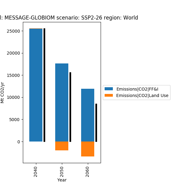
Sometimes stacked bar charts have negative entries - in that case it helps to add a line showing the net value.
data = df.filter({'variable': 'Emissions|CO2|*',
                  'level': 0,
                  'region': 'World',
                  'year': [2040, 2050, 2060]})

fig, ax = plt.subplots(figsize=(6, 6))
data.bar_plot(ax=ax, stacked=True)
add_net_values_to_bar_plot(ax, color='k')
fig.subplots_adjust(right=0.55)
plt.show()
Total running time of the script: ( 0 minutes 0.203 seconds)